Using the Basic Gallery Element will help you create beautiful image galleries, from where you can style and customize its design for ultimate configuration capability.
Content Tab
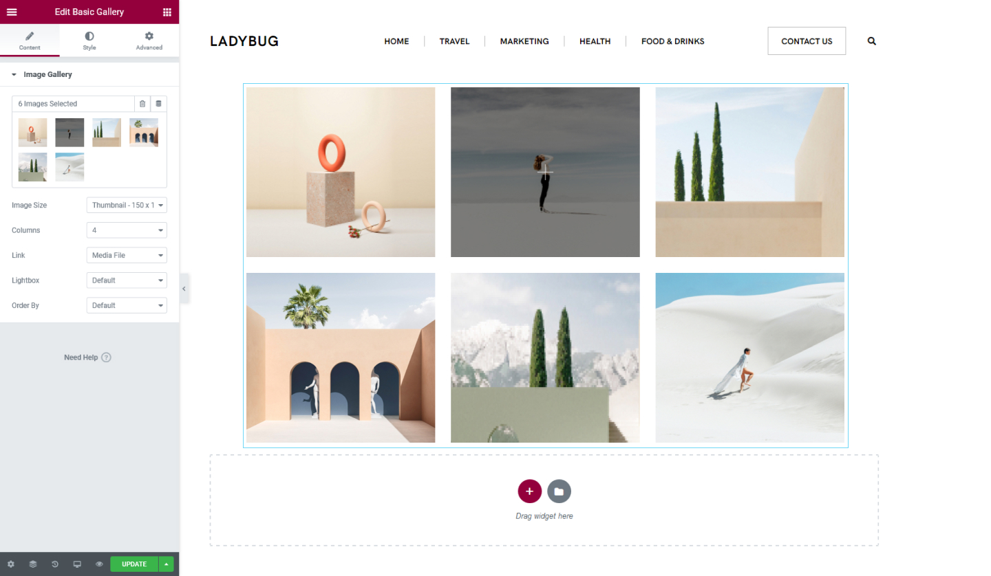
Image Gallery
- Add Images here. Select the images you want to include and click on Create Gallery.
- Image Size - Set the size of the images from Thumbnail to Custom size
- Columns - Determine how many columns you want to display
- Link - You can link the images to their respective media files, attachment page, or none. If you select Media FIle, then you can display the images to be shown in a lightbox
- Order By - You can determine the order of the images either by Default or Random
Style Tab
Image
- Spacing - Set the spacing between the images, select either Default or Custom
- Border Type - Set a border for the images, either Solid, Double, Dotted, Dashed, or Groove. If you select one type of border you can choose its width and select its color
- Border Radius - Set the border-radius for the images to make them rounder
Caption
- Display - You can choose to show or hide captions. If you choose to show the caption you can tweak the following options
- Alignment - Align the caption to be positioned either Left, Center, Right, or Justified
- Text Color - Choose a color for the caption's text
- Typography - Tweak the typography options for the caption's text
Set the settings for the Advanced Tab that is appropriate for the element.