The Icon List element will provide to set easy to follow list of items, each of which has its own icon.
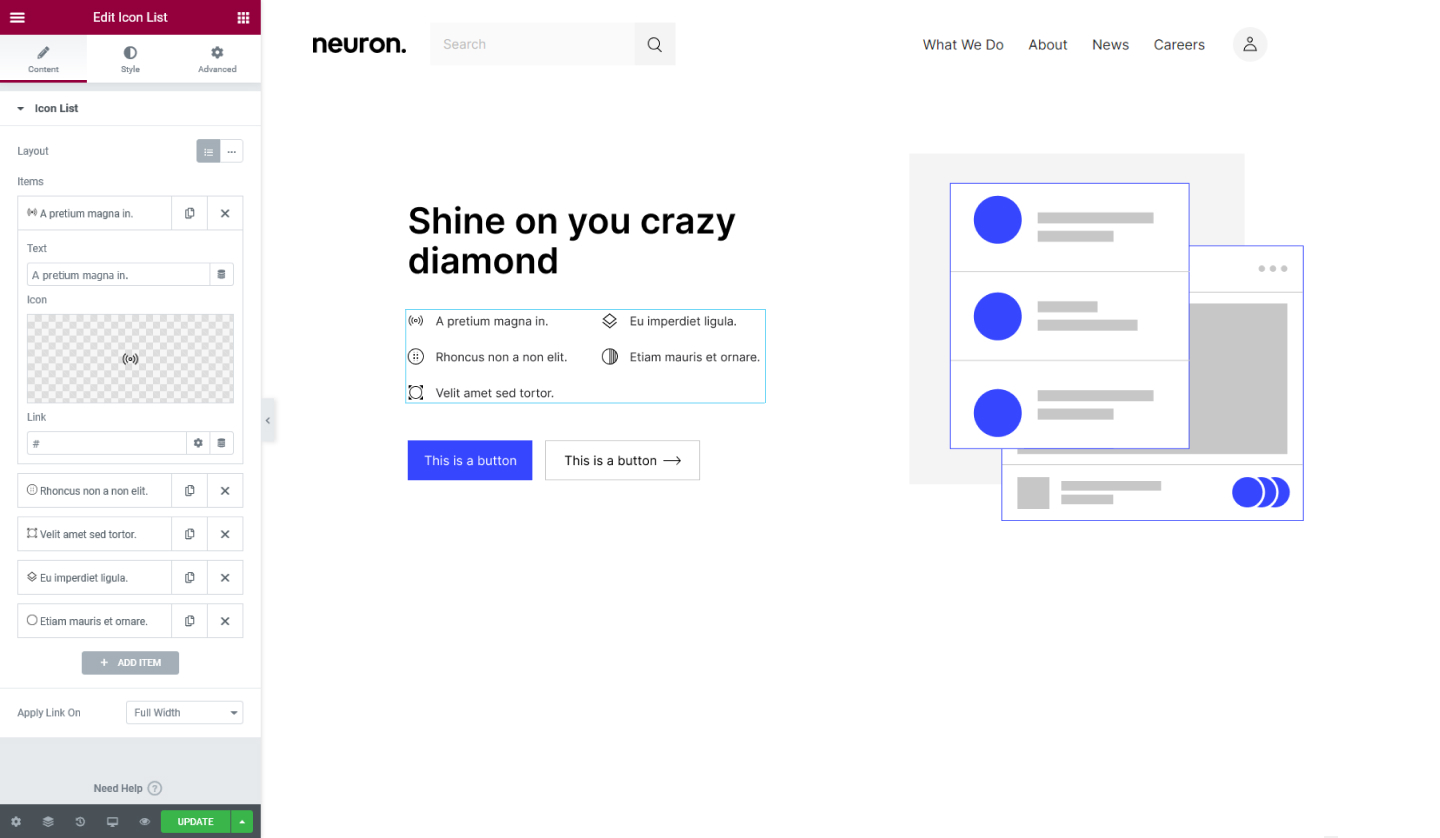
Content Tab
Icon List
- Layout - Set the layout to either Default or Inline, this will allow the icon list to appear either vertically or horizontally
- Items - Add the list items here, click on the list item to open its settings where you can set the title, choose an icon, and enter a URL link.
- Apply Link On - Choose to apply link on Full Widht or Inline. If you choose the Full-Width option the item will be clickable even if the user clicks further the item's text.
Style Tab
List
- Space Between - Set the space between the list items
- Alignment - Set the alignment for the list items either Left, Center, or Right
- Divider - Switch the handle on to show a divider between the list items.
If you set the Divider on you will have the following options
- Style - Choose the style for the divider to wither be Solid, Double, Dotted, or Dashed
- Weight - Set thickness of the divider in value
- Width - Set the width for the divider
- Color - Set the color for the divider
Icon
- Color - Set the color for the icon
- Hover - Select a color for the icon when the users hover over it
- Size - Set the size of the icon
- Alignment - Set the alignment of the icon to either be Left, Center. or Right
Text
- Text Color - Set the color for the item's text
- Hover - Choose a color for the text when the users hover over it
- Text Indent - Set the space between the icon and the text
- Typography - Tweak the typography options for the text
Set the settings for the Advanced Tab that is appropriate for the element.