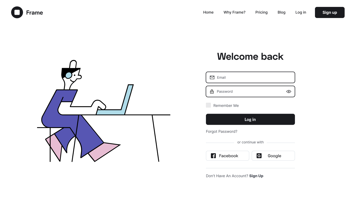
The Login element will prove to be a useful tool for creating advanced custom login pages instead of the default WordPress login pages. To start creating your custom login page create a new page ad drag in the login element.
Content Tab
Form Fields
- Label - Choose to either show or hide the label
- Input Size - Decide on the size of the login's input from Extra Small to Extra Large
Button
- Text - Type in the button's text
- Size - Choose the size of the button
- Alignment - Set the alignment of the button either Left, Center, Right, or Justified
Additional Options
- Redirect After Login - Choose to have your users redirected after they log in and type in the page where you want them redirected.
- Lost your password? - Choose to leave the lost password option open by switching the handle on.
- Remember Me - Choose to either show or hide the "remember me" option.
- Logged in Message - Choose to either show or hide the logged in message
- Custom Label - Change the custom placeholder labels.
Style Tab
Form
- Rows Gap - Set the gap between the rows
- Links Color - Set the color for the links
- Links Hover Color - Set the color for the links when they are being hovered \
Label
- Spacing - Set the spacing between the labels
- Text Color - Set the text color for the labels
- Typography - Tweak the typography options for the labels
Fields
- Text Color - Select the text color for the content in the form fields
- Typography - Tweak the typography options for the content in the form fields
- Background Color - Set the background color for the fields
- Border Color - Set the border color for the fields
-
Border Width - Set the border width for the border of the fields
-
Border Radius - Set the border radius for the border of the fields
Button
- Text Color - Set the color of the button's text
- Typography - Tweak the typography options for the button's text
- Background Color - Set the background color for the button
-
Border Type - Choose a border for the button either Solid, Double, Dotted, Dashed, or Groove.
-
Border Radius - Set a border-radius for the button
-
Text Padding - Seet the exact value of padding around each side of the button's text
Logged in Message
- Text Color - Set the text color for the logged-in message
- Typography - Tweak the typography options for the logged-in message
Set the settings for the Advanced Tab that is appropriate for the element.