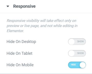
This is yet another responsive design trick that will save you time and effort into making your website responsive ready. You can hide sections/columns/elements that are way too big and not appropriate for smaller devices and replace them with sections that are specifically made for mobile editing. To hide element you will need to:
- To hide a section go to Section Settings > Advanced Tab > Responsive
- To hide a element go to Element's Settings > Advanced Tab > Responsive
- Locate Visibility and choose to Hide on Desktop, Tablet, or Mobile.