The Button Element will allow you to add, customize, and style buttons using the most advanced set of tools and options.
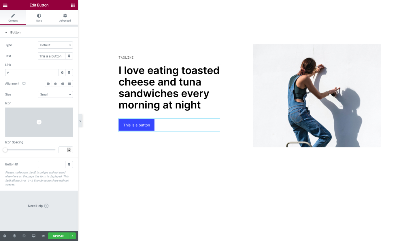
Content Tab
Button
- Type - Choose the type of button. It can either be Info, Success, Warning, or Danger.
- Text - Type here the text for the button
- Link - Enter the URL to link the button. If you click on the cog icon you will be presented with more options, where you can add a rel=nofollow attribute or open the link on a new tab
- Alignment - Set the alignment for the button, it can either be positioned to the Left, Center, Right, or Justified
- Size - Set the size of the button. It can either be Extra Small, Small, Medium, Large, or Extra Large
- Icon - Set an icon for the button. Choose one from the library or upload an SVG
- Icon Position - Set the icon to either be before or after the button's text
- Icon Spacing - Set the spacing between the icon and the button's text
- Button ID - Assign a unique ID for the button
Style Tab
Button
- Typography - Tweak the typography options for the button
- Text Shadow - Set a shadow to the button's text
- Text Color - Set the color for the button's text
- Background Color - Set a color for the button
- Border Type - Choose a border type for the button it can either be Solid, Double, Dotted, Dashed, or Groove
- Border Radius - Set the border-radius to make the button's edges rounder
- Box Shadow - Choose to add shadow to the button and configure the options available
- Padding - Add padding around the content of the button
Set the settings for the Advanced Tab that is appropriate for the element.