The Divider Element will provide a useful and handy feature to help you make a distinction between content. You can choose from a variety of 25+ SVG dividers, also to enhance the style you can add text or icon before, after, or between the divider.
Content Tab
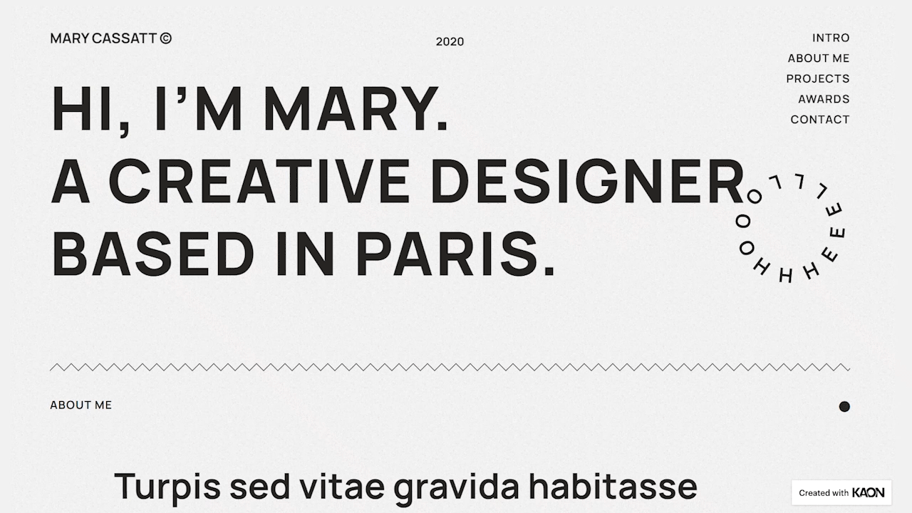
Divider
- Style - Set the style for the divider. The list will include 25+ SVG dividers that you can choose from
- Width - Set the width of the divider
- Alignment - Set the alignment of the divider to either be Left, Center, or Right
- Add Element - Add an element for the divider. It can either be None, Text, or Icon.
Style Tab
Divider
- Color - Set the color for the divider
- Size - Set the size for the divider
- Amount - Set the number of patterned elements for the show for the divider
- Gap - Set the gap for above and below the divider
Text
- Color - Set the color for the text
- Typography - Tweak the typography options for the text
- Position - Set the position of the test to either be Left, Center, or Right
- Spacing - Set the spacing between the text and the divider
Icon
View: Default
- View - Choose from the three options available of the view style for the icon. You can leave it as Default, Stacked, or Framed. Each comes with its own settings
- Size - Set the size of the icon
- Primary Color - Set the primary color for the icon
- Position - Set the position for the icon to either be Left, Center or Right
- Spacing - Set the spacing between the icon and the divider
- Rotate - Drag the handle to rate the icon position
View: Stacked
- Size - Set the size of the icon
- Padding - Set the padding value for the icon
- Primary Color - Set the primary color for the icon
- Secondary Color - Set the secondary color for the icon
- Position - Set the position for the icon to either be Left, Center or Right
- Spacing - Set the spacing between the icon and the divider
- Rotate - Drag the handle to rate the icon position
- Border Radius - Set the border-radius for the icon to make the edges rounder
View: Framed
- Size - Set the size of the icon
- Padding - Set the padding value for the icon
- Primary Color - Set the primary color for the icon
- Secondary Color - Set the secondary color for the icon
- Position - Set the position for the icon to either be Left, Center or Right
- Spacing - Set the spacing between the icon and the divider
- Rotate - Drag the handle to rate the icon position
- Border Width - Set the width of the border in values or simply drag the handle
- Border Radius - Set the border-radius for the icon to make the edges rounder
Set the settings for the Advanced Tab that is appropriate for the element.